Windows OS is among the most used operating systems out there and since its inception in 1985 with Windows 1.0, we have seen quite a lot of new features and functionalities in every new major Windows OS release.
There are some iconic features in the Windows operating system that we all know and love and one among them is the Windows Start Menu. The Windows Start Menu was first seen on the Windows 95 version which was launched back in 1995 and since then the feature has stuck on with all the latter Windows releases till date excluding Windows 8 and Windows 8.1.
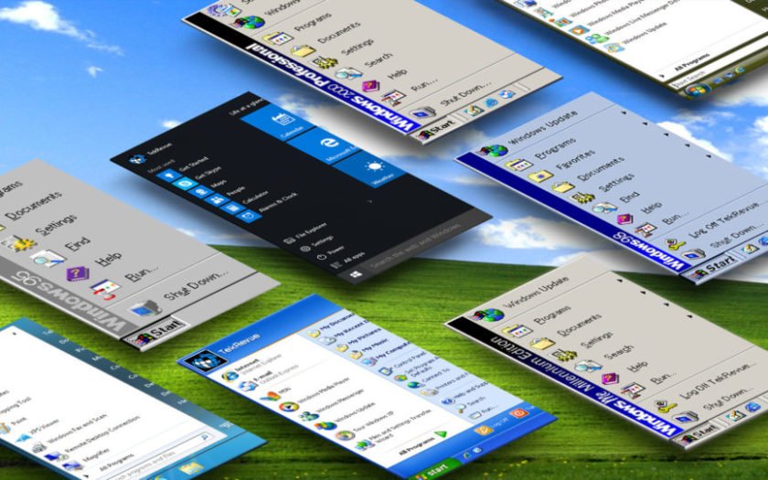
With the Windows Start Menu being available on 8 different Windows OS versions including the latest Windows 10, today we will be looking at how the Start Menu has evolved in Windows over the years to give you a perspective on how the most iconic Windows feature has been made modern in all these years.
How Start Menu has Evolved in Windows Over the Years?
Windows 95 (Launched: 1995)
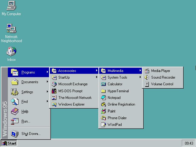
Windows 95 is the first version to feature the Start Menu, along with the Windows NT 4 which was an enterprise edition OS. The Start Menu was a simple drop box designed to organize and group all the features and functionalities present in the Windows OS.
Prior to the addition of the Start Menu, there was a Program Manager window through which all the applications installed on the computer could be accessed.
The Start Menu was placed alongside the Windows Taskbar which itself offered a quick access to simple controls of the computer like Volume, Time and Date, Network Connection and so on.
Windows 98 (Launched: 1998)
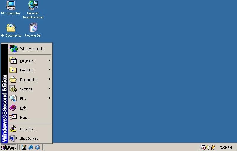
The Start Menu on Windows 98 featured a similar appearance to that on the Windows 95 including the icons, typography, layout, and functions. However, one major addition to the Start Menu was a “Log Off” option which was added to utilize the multi-user account feature that came along with Windows 98.
A “Favorites” folder was also added to the Start Menu where users could group their most used applications. Moreover, Windows 98 featured several features and widgets which would utilize the internet boom that we saw in that era.
Windows 2000 (Launched: 2000)
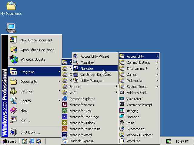
The Windows 2000 was the Windows OS targeted towards professional use rather than on a home PC. Despite its “professional-use tag”, the look and function of Start Menu remained the same as on previous Windows versions. However, new functionalities were added to make the Start Menu more meaningful for the users.
A Windows Update shortcut was placed within the Start Menu so that all important security updates could be installed easily. Moreover, users could now directly launch programs easily and set default applications at the top in the Start Menu.
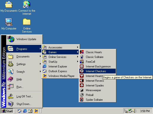
Windows ME (Launched: 2000)
The Windows Millennium Edition or Windows ME was launched short after Windows 2000 in the same year. The Windows ME was a home-use oriented version of Windows whereas the Windows 2000 was professional use.
Well, most of you may not even know about the Windows ME version as it was the least popular of all. Windows ME had lots of bugs and stability issues and was titled the Windows “Mistake Edition” by PC World.
Talking about the Start Menu, it did retain its position in the Windows ME version. Both the Windows ME and Windows 2000 had identical Start Menu design and features.
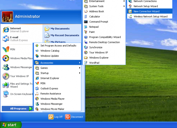
Windows XP (Launched: 2001)
The Windows XP version actually took the operating system to the millennium era with modern looks and features. Windows XP is, without a doubt, the most successful Windows version of all time and still after 14 years of release, is still used by millions worldwide.
What made Windows XP so popular is that even though it retained the overall layout of the Windows OS till then, it presented a completely redesigned look along with new functionalities and features. Windows XP was graphically advanced as well making it a pleasant visual experience to use the operating system.
The Start Menu on Windows XP also got a new design. With a colourful and wider layout, the Start Menu now had two sections with system settings and folders being placed to the right side and program access to the left side.
Windows Vista (Launched: 2006)
Despite being the successor to Windows XP, Microsoft kind of screwed up with Windows Vista. Well, the “Windows Aero UI” that was introduced with the Windows Vista was quite graphic-intense and made the UI experience feel futuristic.
However, the OS was not able to perform satisfactorily on lower and mid-end hardware and received a lot of criticism for that.
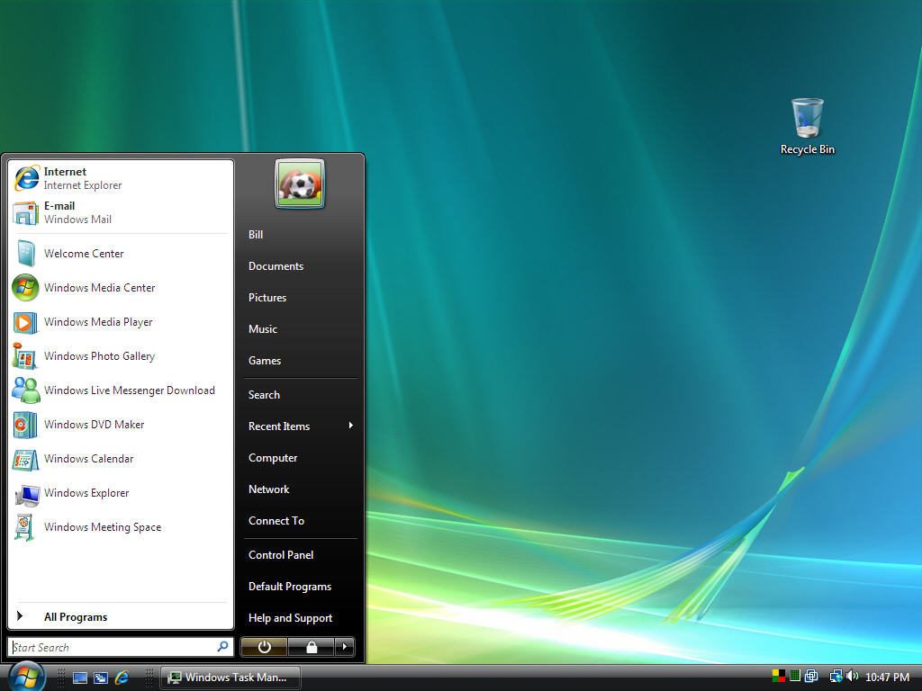
The Start Menu lost its “Start” launch icon and the Microsoft logo took its place in Windows Vista. The underlying layout and function remained same as that on Windows XP, but the icons of the left-side were removed to offer a clean look.
A “Live Search” bar was added to Start Menu let users search files or folders instantly, whereas on previous versions the Windows Search window had to be launched to do the same.
Windows 7 (Launched: 2009)
Windows 7 is the next most popular Windows version after Windows XP. Even though Windows 7 retained most of the features and functionalities of Windows Vista, it did so by taking down the graphics requirement of the UI and also focusing heavily on stability and performance.
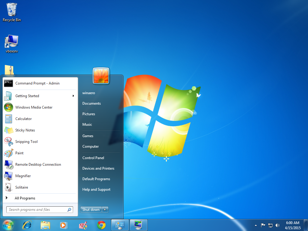
The Windows 7 Start Menu, which is completely identical in terms of function to Windows Vista, had a simpler design and layout that matched well with the rest of the OS. Searches and menu accessible from within the Start Menu were made to be faster.
Windows 10 (Launched: 2015)
Windows 8 and Windows 8.1 are missing from this list as Microsoft attempted for a completely revamped UI removing the iconic Start Menu for these two versions.
Well, even though the “Start Screen” on Windows 8 and Windows 8.1 could be called as an advanced Start Menu, it took away the simplicity of the Start Menu for a live-tiles approach which was quite cumbersome to use.
Microsoft later told that the Start Menu would make a return in a future Windows update. That update actually turned out to be a new Windows version named Windows 10.
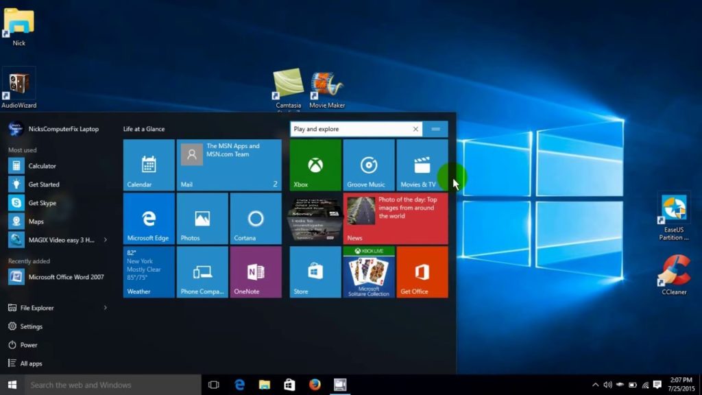
Windows 10 is the latest version of the OS currently and it does feature the Start Menu in its iconic position, in the leftmost corner of the taskbar. The Start Menu has a completely new design though, with applications grouped by alphabets taking the left side and live-tiles of various third-party and system apps taking the right side.
Final Words
The Start Menu was one of the features that Windows users requested Microsoft to bring back the most when they removed it from the Windows 8 and Windows 8.1 versions. As the Start Menu has finally returned with the Windows 10 version, it does seem like Microsoft has heard the concern of Windows lovers and it looks like Microsoft won’t attempt to remove the Start Menu anytime soon again.

